Hello, I'm Jeff Walstrom
Father, Husband, Creator of Software
Software Design & Development
Mobile Applications
Product Creation
I am a software professional, entrepreneur that enjoys creating and working with companies that disrupt the status quo.
Welcome
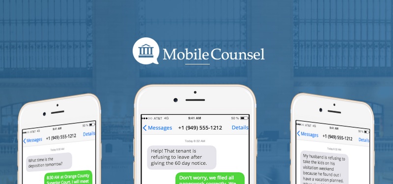
Currently creating mobile business software at Beachfront Labs is my latest endeavor. We have two SaaS products PushForms and MobileCounsel.
I love to meet and work with people who are passionate about doing innovative projects in the technology space.
Me in 10 seconds
I'm a father, husband, entrepreneur, programmer, change agent, surfer, waterman, book reader, and avid technology geek.
I have a passion for optimizing life. I want to learn and experience as much as I can before I die. Dream big, work hard and stay humble.
I strive for my children to be "makers instead of takers", creators will be the leaders of tomorrow.
Total introvert (INTJ). I thrive in solitude.
Fitness and eating healthy are important to me. I work at a treadmill desk during the day, ride my bike to work and strive to live an active lifestyle. I just started tracking my daily steps.
California native. I now live in beautiful San Clemente, CA.
Accolades
Builder of multiple software products used and enjoyed by millions of people on a daily basis.
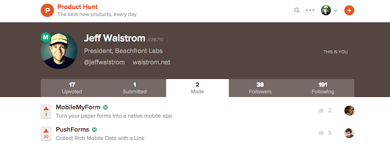
Creator of software as a service (SaaS) products that have been featured in ProductHunt
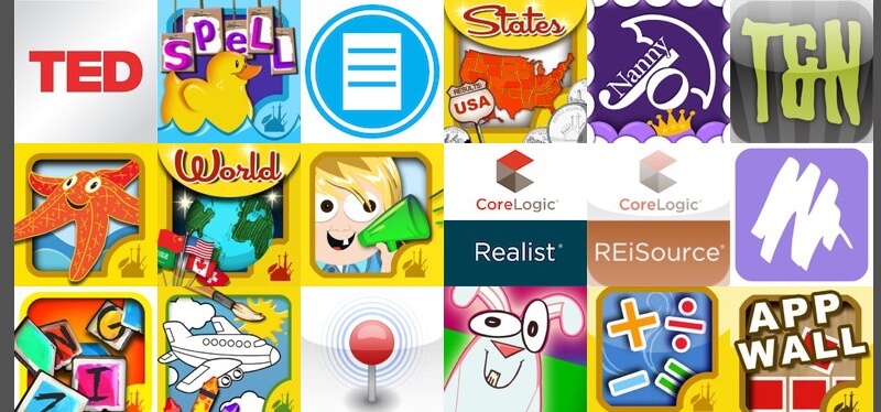
Created over 50 iOS and Android apps including multiple number one-ranking applications, over fifteen of which have been featured by Apple and Android in their marketplaces.
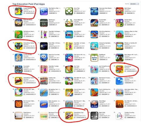
Attained over ten percent of the top fifty applications in the education space in the Apple App Store.
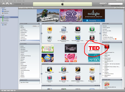
Participant and attendee of Destination Imagination and TED events. I was lucky enough to create the first iPhone and Android TED applications.
Driven to spread the creativity process to kids and adults of all ages.
Check out some of my
latest software products
From small businesses to the Fortune 500, we are all in this together. I build software that solves your business pain points allowing your company to grow and thrive.
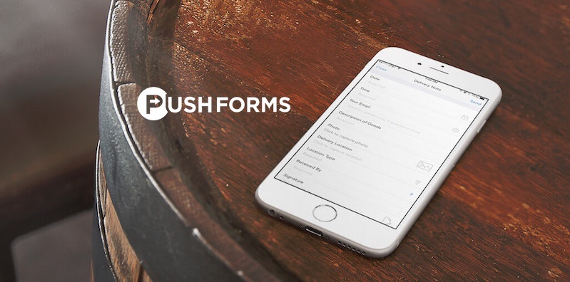
PushForms
Collect rich mobile data with a link.
Native mobile Forms platform for iPhone and iPad